Majestic Before After Image
A simple and easy to use WordPress plugin to compare two images with a beautiful slide.
Plugin Installation
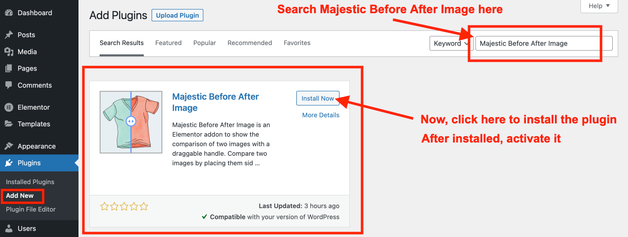
- Go to Plugins >> Add New
- Search “Majestic Before After Image”
- You will find the plugin listed on the search result
- Install and activate it
Or you can download the Majestic Before After Image plugin from here, upload it to your site from wp-admin > Plugins > Add New and activate it as shown below.

Getting Started
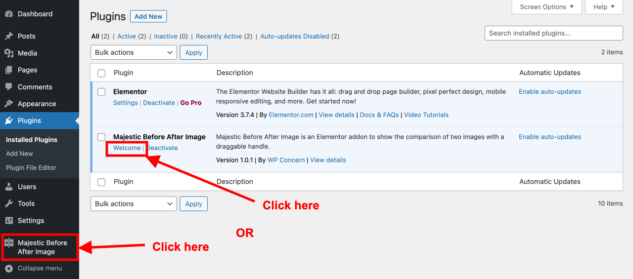
Click on the Welcome text on the plugin listing as shown above. Or, click on the ‘Majestic Before After Image at the left sidebar of your WordPress dashboard.
After that, you will be redirected to the options page of the plugin where you will find useful links and information related to this plugin.
Create a Page with Elementor
After you activate Elementor and Majestic Before After Image plugins, go to Pages > Add New and create a new page. Select the ‘Default template’, ‘Elementor Canvas’, or ‘Elementor Full Width’ template based on your requirement and publish the page. After you publish the page, Edit it with Elementor.

Add a new section and choose a structure of columns (as shown in the screenshot above).
Search & Add (Drag & Drop) Widget
Scroll down the Elementor widgets panel to find ‘Majestic Before After Image’ or you can search ‘Before After’ on the search box as shown below.
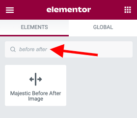
After this, you can drag and drop the ‘Majestic Before After Image’ widget to a section you have just created (explained above). It comes with various options to customize images comparison. Each of them is explained and shown below.
General Options
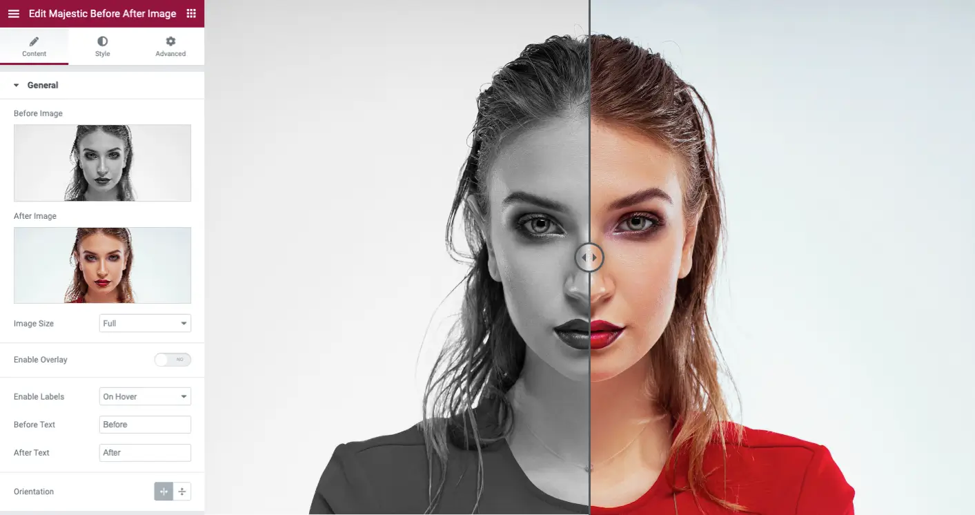
- Before Image: Image to show in before (first) section
- After Image: Image to show in after (second) section
- Image Size: Option to select the size of the images
- Enable Overlay: Option to enable or disable overlay
- Enable Labels: Option to show before and after labels. It supports 3 types: On Hover, Always and Never. Select Never if you like to hide labels
- Before Text: Option to change the text of the before button
- After Text: Option to change the text of the after button
- Orientation: Option to select the horizontal or vertical orientation
Handle
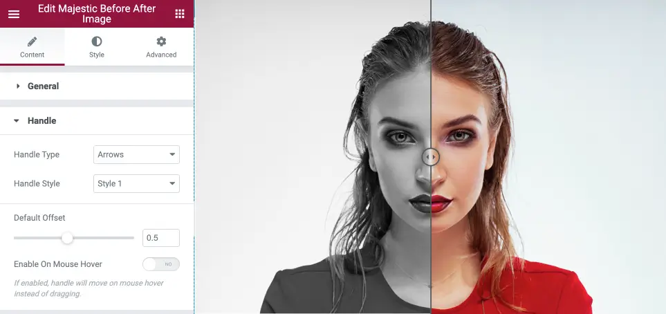
- Handle Type: Supports two types of handle – Arrows or Text
- Handle Text: You will find this option if you select Handle Type: Arrows. Here you can add custom text such as Drag, Move, VS, etc to handle
- Circle Size: You will find this option if you select Handle Type: Arrows. With this option, you can select the size of a circle used for the handle
- Handle Style: You can select six types of the handle
- Default Offset: This is the option to fix the position of the divider(handle). You can set this value between 0.1 to 1.
- Enable On Mouse Hover: If this option is enabled, the handle will move on mouse hover instead of dragging
Style Labels
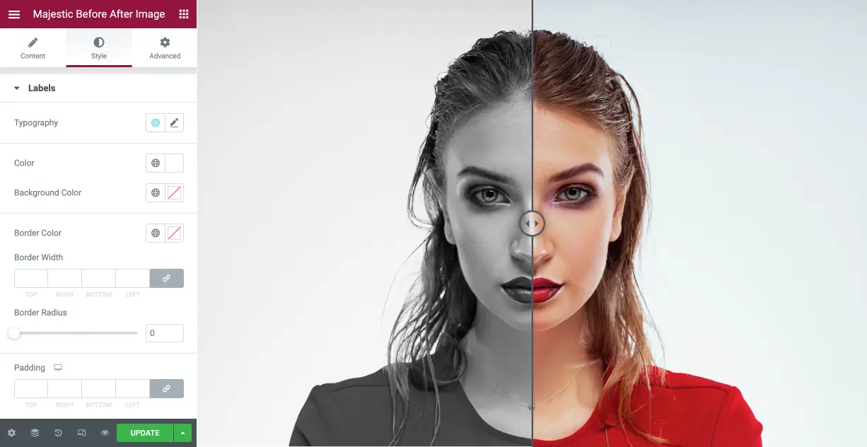
- Click on the ‘Style’ tab as shown above. You will find options to change the typography, color, background, border, padding, etc of the labels (before and after texts) in this widget options.
Style Handle
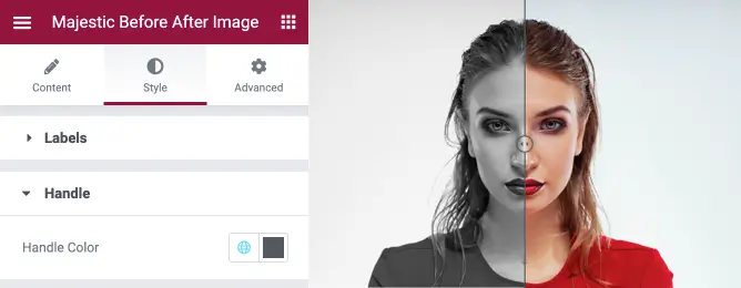
Click on the ‘Style’ tab and Handle as shown above. You will find options to change the color of the Handle here. It will apply to the circle and arrows of a handle.
Support
We provide support through an official support forum of WordPress plugins. Please click here to post your support request if you are having any difficulties using this plugin.